How stats led me to cartooning
So I started a Masters of Business Administration. A somewhat unexpected side-effect was a renewed interest in graphic design, given how much of said course relies on “eye-popping” presentations.
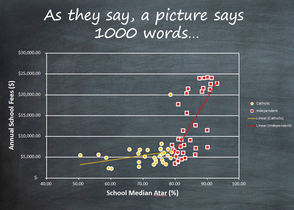
It started with this, a cartoon using the template of Daria characters to outline a presentation on ICSEA scores and how they related to educational outcomes (basically we found the higher the education level of parents, the more expensive the school is. Or vice versa. Whatever, that’s not the point):
 Through this assignment, I learnt how to make the background of a table transparent, and edit the outline and fill of the chart.
This turned out to be really useful because we were able to use the chalkboard background for the entire presentation.
Edbusters above is written using a PicMonkey font, importing it to PPTX as a jpeg, then editing it so the background is transparent. A bit convoluted but at least it looks better than wordart. For the record, we did not use Comic Sans as the font, I think this font is actually called Chalkboard.